A Font for Mogee Game
Turning back, it’s hard for me to imagine that I could face the task of developing a pixel-art font for a game without using font editors and game-engines that support fonts. It all started with the fact that me and Andrey took part in #LOWREZJAM game jam. The rules were to make a game with a resolution of 64×64 pixels.
The Story
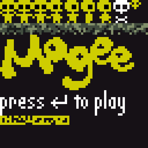
We play a little yellow alien, who is being followed by a purple monster. The goal is to pass as many screens as possible, while the speed of monster progressively increases.
The first version of the game was completed within three days. The png sprite, which included the entire graphics of the game, looked quite simple. The typography that we used in the game was extremely basic. Only “press to play” and numbers for the score.
Type Design
The idea of developing a full-fledged font appeared later, when Andrey held a talk at elm-conf and we decided to put slides inside the game. This defined the primary use case of the font: it had to be a part of the game, and had to fit the screen of a fairly low resolution.
And this is the first question that you should solve, namely how to find or create a font that will suit the game world, will be readable, and will meet your technical needs.
Since the game took place in the underworld, I decided to make descenders disproportionately extended to ascenders. This created the impression of a cave with stalactites or subterranean tree roots. Because of the lack of space that we had on the screen with 64 px, I preferred condensed font to the one with normal width. Therefore, most of the lowercases had just 3 pixels width. For the same reason I choose on proportional instead of monospaced font, with supporting of kerning and ligatures.
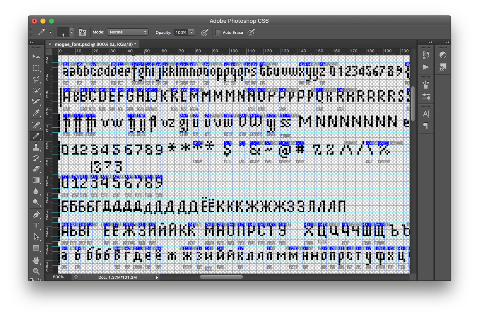
The font was developed in Photoshop, where, using slices, I separated all the characters and saved each one as a png. Every glyph is named by its unicode and ligatures with several unicodes separated by underscore. I should mention that PS is not a common software among game designers. Usually you are using Glyphs, Robofont or FL. But in our case there were no place where you can load your otf. ttf. or bitmap font.
Creating a Font File
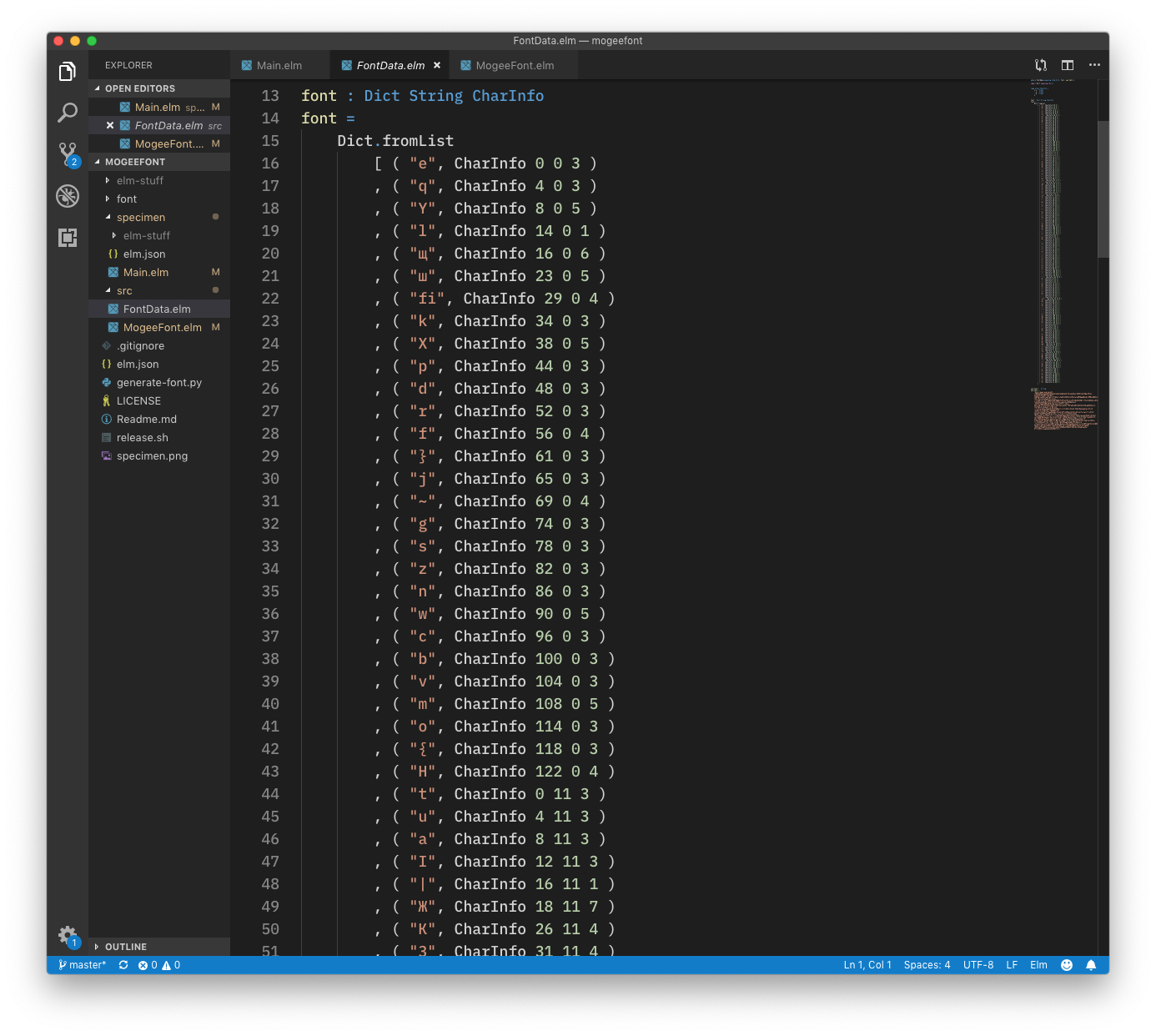
All glyphs were collected in a PNG sprite, from which it was possible to obtain information on the width, height and coordinates. What do we need this for? The font rendering system, that Andrey has written, uses WebGl to rasterise each glyph on a screen, that’s why one of the options was to upload every glyph as a separated image.
Development
Due to the fact that we didn’t have graphical user interface for this purpose, the second part of the work on the font took place directly in the text editor.
Using condensed font was a right decision, but still, there was a room for improvement. To reduce a space between characters we needed to create a system of ligatures and assign spacing and kerning. Ligature is a combination of two or more characters into a single glyph. Spacing and kerning are the processes of adjusting the distance between glyphs.
First of all spacing was assigned. By default left side bearing is equal to 0 and right side bearing is equal to 1 pixel. After that I defined kerning classes.
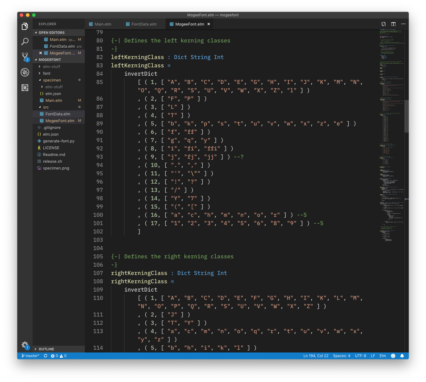
To improve rhythm of the text and to save a couple of pixels of the space I added ligatures to avoid optical big holes between glyphs.
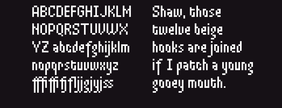
The result looks like this. Later I added Cyrillic as well. It is still work in progress. To try Mogeefont begin to type text in the left text field.
To try Mogeefont begin to type text in the left text field.
License
Now the font is distributed as an elm package.
Mogeefont as well as the game itself are open source projects. You are welcome to contribute to both of them.